API Documentation Quality Metrics for Developer Experience
Measure documentation quality through developer behavior, not page counts.

API documentation quality is measurable. That's the whole argument of this piece: teams that treat documentation as a matter of taste often overlook a set of behavioral signals sitting right in front of them, from search logs to support tickets to the exact moment a developer gives up and closes the tab.
The 2024 Stack Overflow Developer Survey, which drew responses from more than 65,000 developers, found that 84% of them use technical documentation as their primary learning resource, and 90% of those rely specifically on API and SDK documentation to do their jobs. That's the dominant channel through which developers learn how your product works, and it deserves the same measurement discipline a team would apply to checkout conversion or feature adoption. This article lays out four categories of metrics, discoverability, accuracy, completeness, and task success, and shows what each one signals and what to do once you see it.
What poor documentation actually costs, in terms teams can take to leadership
Here's a number worth sitting with: in the 2021 Stack Overflow Developer Survey, 63% of developers named poor documentation as the primary reason they abandoned a new library or API. Other common friction points trailed behind it. Documentation is the single largest reason a developer walks away from something your team built, tested, and shipped.
Abandonment isn't a one-time loss either. It compounds. A developer who bounces off your docs doesn't just fail to integrate today; they tell a coworker, they post in a forum, and your product's reputation among developers takes a hit that outlasts the specific bug or gap that caused it. Reputational damage in developer communities is sticky in a way that's hard to undo with a changelog entry.
Then there's the support ticket angle, which turns this into a budget conversation. Every ticket that starts with "I'm confused about how to..." is engineering or developer relations time that a clearer paragraph could have saved. Undocumented error codes and missing auth flow details generate tickets you can trace back to the exact page that should have answered the question and didn't. Run a two-to-four week audit pulling support ticket trends, zero-result search queries, and a handful of new-hire interviews, and you'll typically find documentation problems eating a meaningful share of engineering capacity that nobody had labeled as a "documentation cost" before.
Why does this framing matter so much? Because without it, documentation loses every roadmap fight. It competes against a new feature that has a projected revenue number attached, and features win, because features come with math. Documentation improvement needs its own math to compete for the same attention.
How to organize the metrics: four categories that cover the full developer journey
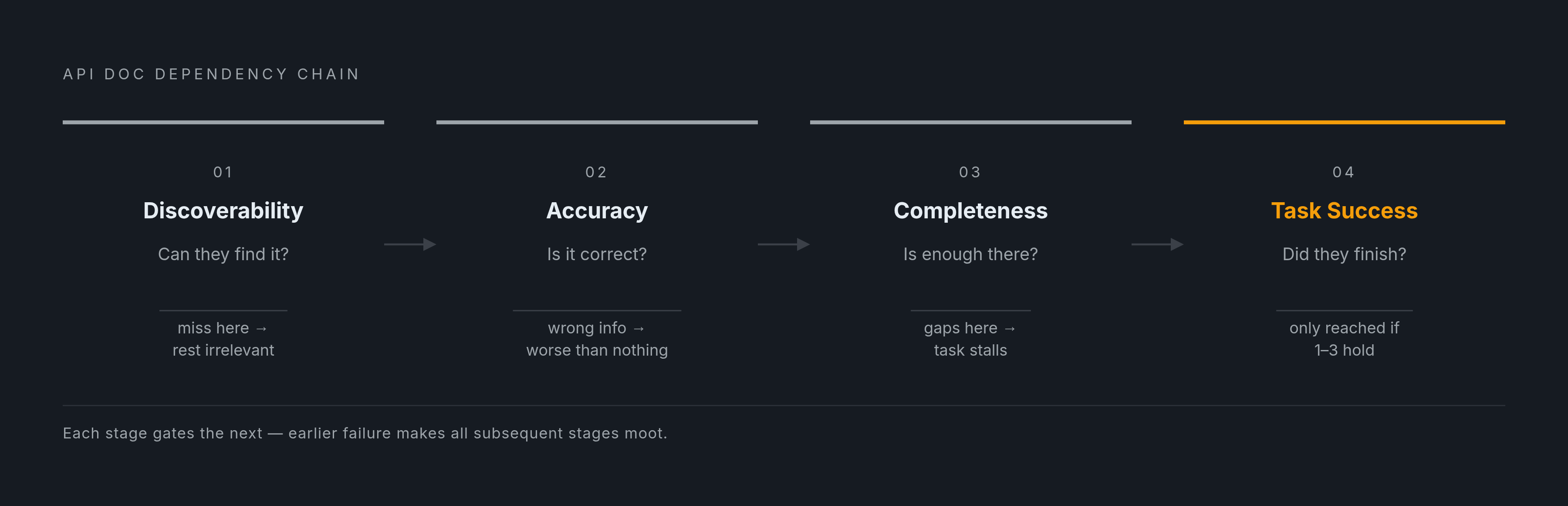
Think about the actual sequence a developer goes through when they land on your docs. First they have to find something relevant. Then they have to trust that what they found is true. Then they have to find enough of it to finish the job. And then, finally, they have to actually succeed at the task that brought them there in the first place. Measurement should follow that same order, because a metric that skips ahead tells you less than it seems to.
That gives four categories: discoverability, whether developers can find what they need; accuracy, whether what the docs say matches what the API actually does; completeness, whether the gaps that would stop a developer cold are absent; and task success, whether developers actually get the job done. Each one builds on the last. Perfect accuracy on content nobody can find is worthless. Perfect discoverability pointing at wrong information is worse than nothing.
Worth naming the anti-pattern directly: total page count, or percentage of endpoints with any documentation at all, sits outside this framework entirely. Those numbers measure volume, not whether the volume does anything useful. A docs site can have thousands of pages and a stats dashboard showing "near-complete endpoint coverage" while developers are still abandoning integrations in droves, because coverage counts pages, not comprehension.
This framework isn't a scorecard you run once a quarter and file away. Its value lies in pointing at a specific intervention, a specific page, a specific missing code sample, rather than in producing a single tidy grade that makes everyone feel good.
Discoverability metrics: whether developers can find what they need before they give up
Start with the single most direct signal available: zero-result search queries inside your documentation portal. When a developer types something into your search bar and gets nothing back, you're looking at a content gap defined in the developer's own words, a direct request for content that doesn't exist yet.
A few things worth tracking alongside it. Zero-result search rate itself, the share of all searches returning nothing, which surfaces missing topics by the exact terms developers reach for. Search-to-page exit rate, meaning developers who search, click into a page, and immediately leave, which usually signals that a page's title or index terms are promising something the content doesn't deliver. High-bounce pages more broadly, where developers arrive and leave without engaging, often correlate with content that's gone stale or was never finished. And navigation path analysis, tracking where developers go before and after landing on a given page, which tells you whether your information architecture matches the mental model developers actually bring with them, rather than the one your writers assumed.
A slower-moving but telling signal: declining developer registrations or flat API key generation numbers. These can be lagging indicators, evidence that discoverability problems have been quietly driving abandonment for a while before anyone noticed the trend in the numbers.
What do you do with all this? Zero-result queries become your content backlog, prioritized automatically. The terms developers searched for and didn't find are, almost literally, the headings of the pages you need to write next. Tools like Google Analytics, Hotjar, and the search analytics built into most documentation platforms already capture this data; the gap is usually in whether anyone's looking at it regularly.
One caveat worth stating plainly: none of this tells you whether the content a developer does find is correct. That's a separate question, and it's the next one.
Accuracy metrics: detecting drift between what docs say and what the API does
Documentation doesn't go stale because writers are careless. It goes stale because of process. An engineer merges a pull request that changes a field name or deprecates an endpoint, the API ships, and updating the docs becomes a separate task, one that doesn't block the release and so gets pushed to "later," which sometimes means never.
From the developer's side, this shows up as wrong field names, endpoints that no longer exist, auth flows that describe a process the API abandoned months ago. These errors don't announce themselves. A developer can burn hours chasing what looks like a code problem before they even suspect the docs are the culprit.
A handful of signals catch this before it spreads. Support ticket topics that cite specific endpoint behavior contradicting what's published are about as direct as evidence gets. Error rate patterns matter too: a spike in 4xx responses on an endpoint that was recently changed often means the documentation hasn't caught up to the change yet. Community and forum reports, developers posting that a specific page is just wrong, are qualitative, but they're reliable, and they tend to name the exact page. And for teams with the infrastructure, automated comparison between the live OpenAPI spec and the published reference pages catches structural drift before a single developer ever encounters it.
Here's the part that's easy to underestimate: accuracy and trust compound in a specific direction. A developer who hits one inaccurate field description doesn't just fix that one error and move on; they start reading every other page with suspicion. The cost of an inaccuracy is never just the one inaccuracy. It's the discount applied to everything else in the docs from that point forward.
The process implication is straightforward, if not always easy to act on: documentation needs to update in the same cycle as the API, not on a separate review schedule that treats docs as an afterthought. Even flawless accuracy, though, doesn't help a developer who needed information that was never written down at all. That's completeness.
Completeness metrics: identifying the gaps that block developers before they can ask for help
Some gaps matter more than others, because some gaps stop a developer before they've made a single call. Five layers tend to carry the highest abandonment risk. The getting-started guide, because if it's missing or thin, nothing after it matters. The interactive reference, where missing parameter descriptions or response schema details push developers into reading source code directly; the Postman 2024 State of the API Report found that roughly half of developers already dig through source code to understand how an API behaves, which is a signal that the reference documentation isn't doing its job. Sandbox or playground access, because without a place to test, developers end up writing against production just to see what happens. Error handling documentation, since undocumented error codes generate a disproportionate share of support tickets. And version or migration documentation, where absence quietly blocks adoption of newer API versions; a low upgrade rate is often a completeness problem wearing the disguise of developer inertia.
On the metrics side: endpoint coverage rate, the share of live endpoints with any published reference documentation. Error code coverage, the share of error codes that come with an explanation and a suggested fix. Code example coverage, the share of endpoints with at least one working sample a developer can copy and run. And SDK version adoption rate, which, again, often reflects the quality of migration guides more than it reflects developer laziness.
Here's the trap. High endpoint coverage can hide low completeness, because "documented" and "usable" aren't the same thing. An endpoint can have an entry that technically exists, with a name and a one-line description, and still be missing parameter details, response examples, and error cases entirely. The coverage number looks healthy. The developer experience underneath it does not.
Tom Johnson's "I'd Rather Be Writing" API documentation course lays out a checklist running past 70 individual points across accuracy, clarity, completeness, and relevance. Run as a periodic structured audit, maybe once or twice a year, it catches things dashboards miss.
Discoverability, accuracy, and completeness together set the stage. What developers do once they're standing on that stage, whether they actually finish the task, is its own category.
Task success metrics: measuring whether developers actually accomplish what they came to do
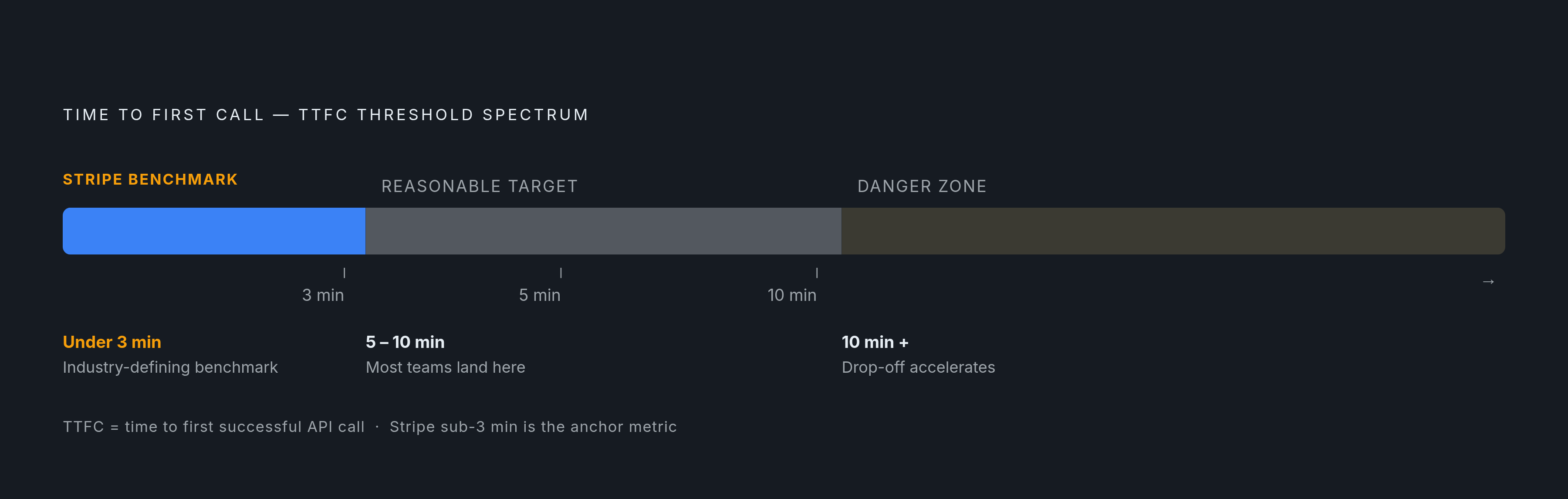
Time to First Successful API Call, TTFC, is the anchor metric here, and for good reason: it measures how long it takes a developer to go from starting onboarding to getting a real response back from the API. Few numbers say more about documentation clarity and onboarding design in one figure.
Stripe is a standout example, with developers able to reach a successful API response in under three minutes from signup. That's the bar the industry points to when describing what a best-in-class getting-started experience looks like. Most APIs won't hit three minutes, and that's fine; a TTFC somewhere under five to ten minutes at the evaluation stage is a reasonable target for most teams. What matters more than the absolute number is the direction: the longer TTFC stretches, the more first-time developers you lose along the way.
TTFC's real strength is as a diagnostic instrument. If it gets worse right after a documentation change, that change introduced friction, whether or not the change looked like an improvement on paper. If it gets better after you add a single ready-to-run code sample, that sample was quietly doing work that a paragraph of prose never managed to do.
Support ticket deflection rate tracks something adjacent: the share of developer questions your documentation answers without a human ever getting involved. Improving error documentation specifically has, in documented practitioner cases, driven meaningful reductions in ticket volume, and because the effect concentrates in specific gaps, it's one of the more actionable metrics on this list.
Integration success rate is a different cut: the share of developers who start an integration and actually finish it, as opposed to adoption rate, which just measures whether they come back. Interactive API playgrounds, meaning the ability to test a call right inside the documentation instead of leaving to set up a local environment, have shown meaningful improvements to this number in practitioner implementations. The ability to test without leaving the page turns out to remove a surprising amount of friction.
Docs-to-signup and docs-to-first-call conversion round this out, tracking the funnel from a documentation visit through account creation and into that first API call. This is where you find exactly which step in onboarding is losing people.
Rabobank offers a concrete illustration of what happens when a team actually acts on these numbers instead of just collecting them: by instrumenting onboarding to find specific bottlenecks and then removing them, the bank reported a substantial jump in deployment velocity along with measurably better developer satisfaction. The metrics changed what the team built next.
Qualitative signals that quantitative metrics miss
Numbers tell you where. They rarely tell you why. A high bounce rate on your authentication page doesn't distinguish between three very different problems: missing context, confusing terminology, or a code sample that's just broken. All three produce the identical chart.
This is where qualitative methods earn their keep. Developer surveys, including something like a net promoter score specifically for documentation alongside open-ended questions about what blocked them, are most useful when segmented by role or experience level, since a first-time integrator and a five-year veteran hit friction in completely different places. Usability sessions, watching a developer attempt a real task with no help from you, surface friction that no analytics tool can see, because it's happening inside the developer's head as they try to reconcile what the docs say with what they're looking at on screen. New-hire onboarding interviews are underrated for this: new engineers encountering docs for the first time, whether internal or public-facing, give you unfiltered signal about gaps and confusing spots before they've been trained to work around them. And community monitoring, GitHub issues, Stack Overflow threads, forum posts that reference a specific page by name, is ambient data that's sitting there whether or not anyone's reading it.
The Developer Experience Index, or DXI, is one attempt to formalize this by measuring several dimensions of developer productivity, documentation quality among them, and combining perceptual data, how developers say they feel about the docs, with behavioral data, what they actually do. That combination matters more than either half alone.
Here's the pitfall worth naming: teams that lean on satisfaction scores alone end up with documentation developers rate positively in a survey while still getting stuck on it in practice. And the reverse happens too; docs that developers grumble about in surveys sometimes perform fine behaviorally, because the grumbling is about tone or formatting rather than actual task failure. Neither kind of data alone gives you the full picture. Run qualitative checks quarterly or on your release cycle, and let the continuous quantitative metrics tell you when it's time to look closer.
AI agents as a second documentation audience that existing metrics don't account for
Something has shifted underneath all of this in the past couple of years, and it changes the stakes for every metric described so far. Coding assistants and agentic tools now read API documentation directly, generating integration code, choosing endpoints, and answering developer questions on their own. Documentation quality now determines whether a piece of software can produce a correct integration, not just whether a human reading the page understands it.
That raises an uncomfortable question for accuracy metrics specifically. If your documentation is out of date, an AI tool doesn't know that; it answers from whatever it learned during training, which can be months behind the current API. A developer using that tool gets a wrong field name or a deprecated endpoint with total confidence behind it, and the resulting failure can be much harder to trace back to its source than a human misreading a page would be.
Completeness takes on a second meaning too. Machine-readable structure now matters as much as human-readable clarity. Documentation that reads perfectly well to a person but is sparse or poorly structured in its underlying markup is effectively invisible to an AI-powered workflow, regardless of how complete a human audit says it is.
A few measurement signals are emerging to track this second audience. Access rates to machine-readable formats, llms.txt files or raw Markdown versions of pages, as distinct from ordinary HTML page views, giving teams a new layer of analytics that separates agent traffic from human traffic. MCP server availability, functioning as a structural completeness signal, since documentation that isn't connected through a machine-readable protocol forces AI tools back onto training data that may already be stale. And a more hands-on test: running a coding assistant against your documentation and checking whether the resulting integration actually works, an emerging quality check focused on whether the docs can be acted on correctly by something that isn't human.
The implication is bigger than it first sounds. Documentation infrastructure that updates automatically alongside API changes, instead of waiting on a manual review cycle, stops being a nice efficiency gain and becomes a correctness requirement, full stop, once agents are reading that documentation and acting on it without a person checking the output first. Static, siloed docs that a determined human might eventually work around become active liabilities the moment an agent is making integration decisions on its own.
Building a metrics practice: what to instrument first and how to act on what you find
Start with whatever signals abandonment, not whatever happens to be easiest to count. That ordering matters more than it sounds like it should, because it's tempting to start with page views simply because the number already exists in your analytics dashboard.
First to instrument: TTFC and support ticket volume broken out by topic. Both are immediately actionable, and both connect directly to a cost figure your leadership already understands, whether that's engineering hours or lost signups. Second: zero-result search queries and high-bounce pages, which convert into a prioritized content backlog within the first week of collecting data, no elaborate analysis required. Third, and only once the behavioral signals are understood: a structured audit of error code and endpoint coverage, run periodically rather than watched continuously, since completeness moves slowly compared to the other categories.
None of this works as a report that sits in a slide deck. Each metric needs to connect to a specific intervention: a zero-result query becomes a new page, a TTFC regression becomes a rollback or a rewrite, a spike in tickets about one endpoint becomes a rewritten error reference. The moment a metric stops pointing at a specific fix, it's decoration. Measuring documentation this way keeps it out of that category and turns it into something a team can actually act on.