Measuring Documentation Quality and Coverage
Forgotten metrics reveal why your docs fail readers even when they look good on paper.

There is a version of this problem every documentation team eventually lives through. Support tickets accumulate around a feature everyone assumed was well-documented. Someone pulls up the page. The prose is clean, the grade level is reasonable, the content exists. And yet developers keep failing at the same step. The metrics said nothing was wrong. The metrics were measuring the wrong things.
That experience, repeated across enough projects, is what makes the measurement question interesting rather than administrative. The 2024 Stack Overflow Developer Survey, drawing on more than 65,000 respondents, found that technical documentation is the top learning resource for developers at 84% adoption, with API and SDK documentation preferred by 90% of developers over any other source. The Atlassian and DX State of Developer Experience Report, published the same year from a survey of over 2,100 developers, found that 41% cite insufficient documentation as a significant source of time loss. These are not marginal findings. They describe infrastructure that is simultaneously indispensable and routinely broken, and broken in ways that teams often cannot articulate because they have no systematic way to see where the failure is.
The argument here is not that documentation needs better scores. It is that documentation needs a signal system: layered, owned, and connected to action rather than to dashboards.
The dimensions worth measuring before picking any metric
Before choosing a tool, it helps to understand what you are actually trying to evaluate. Tom Johnson's widely cited API documentation rubric organizes roughly 80 characteristics into six categories: findability, accuracy, relevance, clarity, completeness, and readability. The list covers more than 70 distinct aspects of a documentation artifact. That breadth is useful, but it can also obscure a more fundamental distinction.
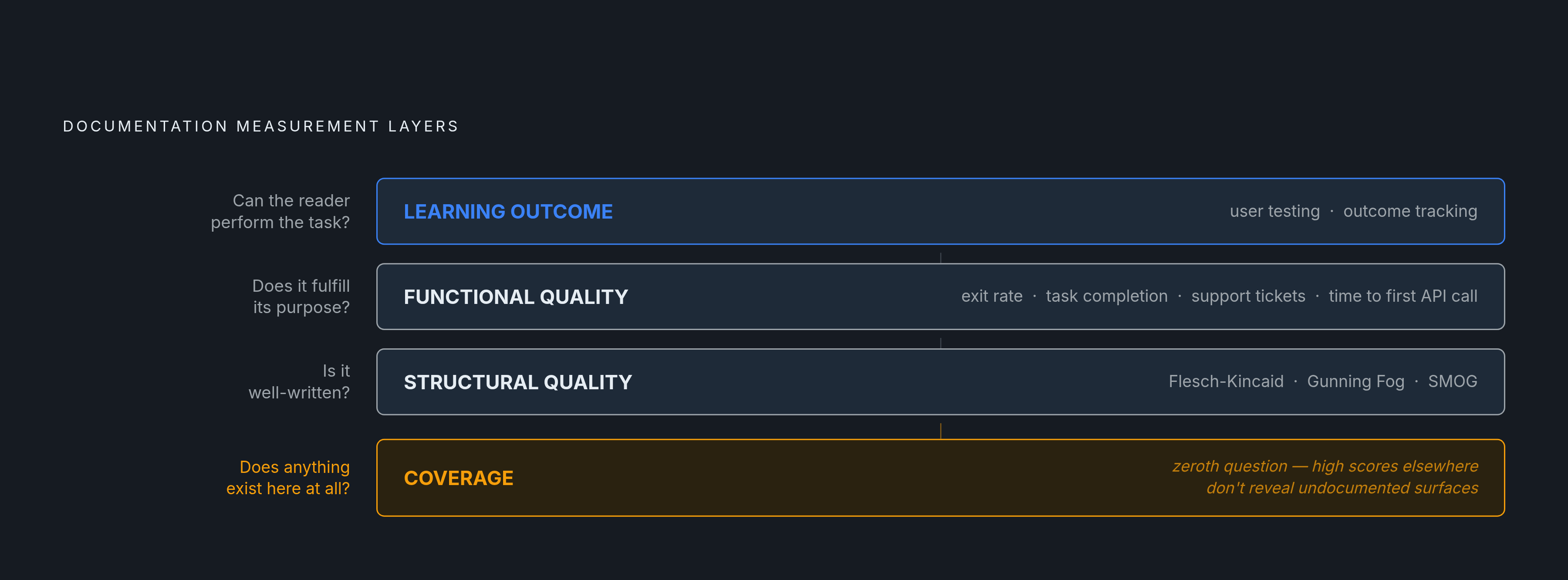
Academic frameworks in the documentation research literature separate functional quality from structural quality. Functional quality asks whether the document fulfills its purpose. Structural quality asks whether it is well-written. The two can diverge significantly. A page that scores well on readability, maintains consistent terminology, and follows style conventions can still fail a user who comes to it with a different goal than the author assumed. Well-structured prose wrapped around the wrong answer is still the wrong answer.
A third layer, drawing on Merrill's Principles of Instruction, adds a learning-outcome dimension: whether the reader can actually perform the task or apply the concept the document was meant to teach. This is a harder thing to measure, but it is closer to what documentation is actually for. Text properties, even excellent ones, are insufficient proxies for instructional effectiveness.
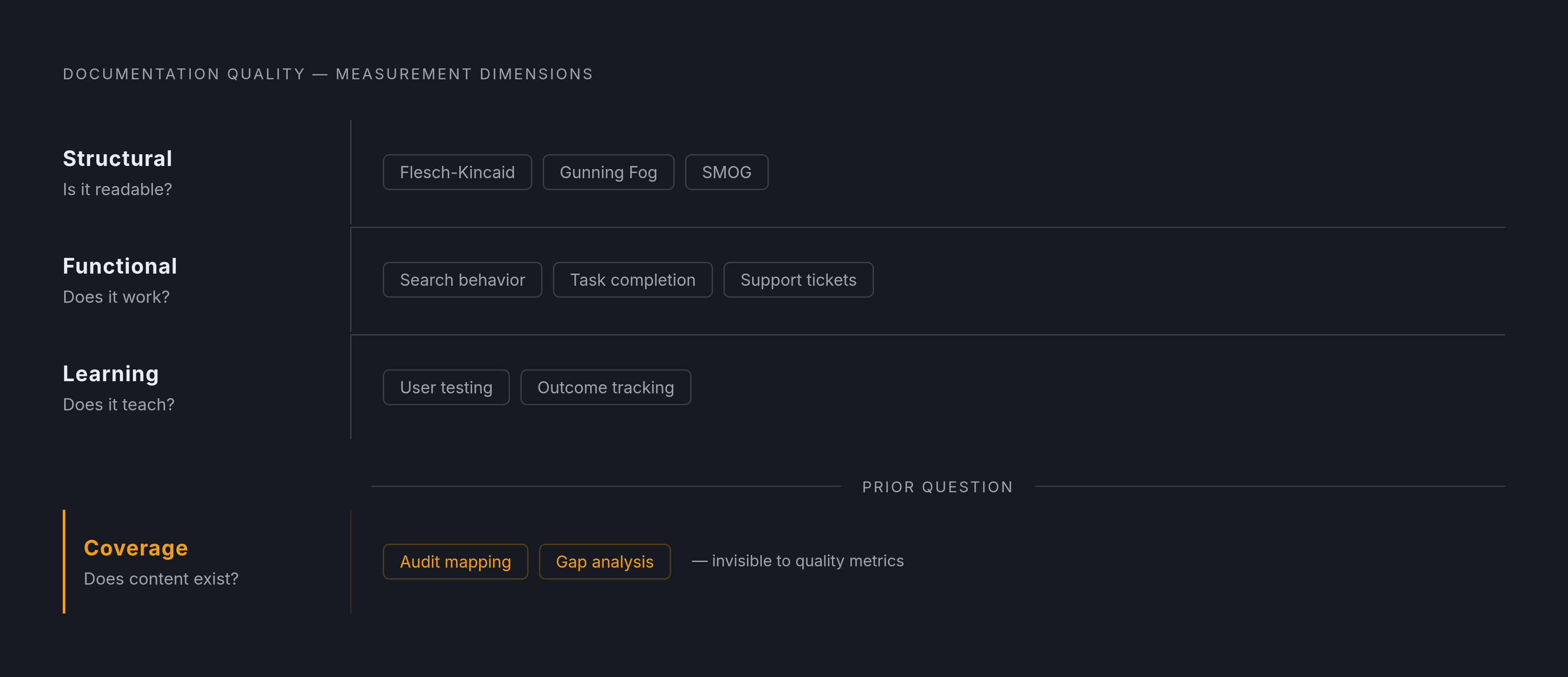
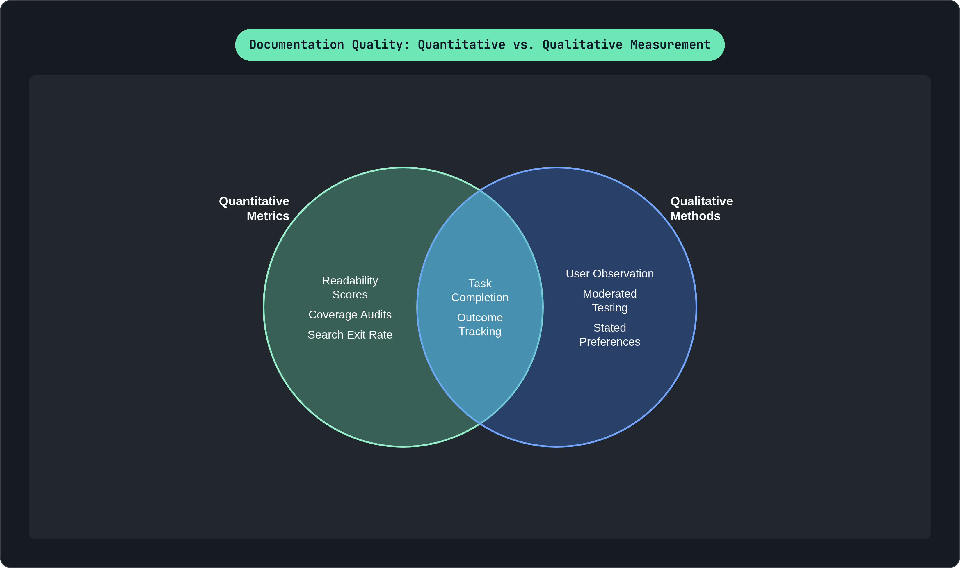
These three dimensions map to different tools. Readability formulas address structural quality. Search behavior, task completion, and support metrics address functional quality. User testing and outcome tracking address learning. A team that deploys only one category of measurement is, by definition, measuring one dimension of a multi-dimensional problem.
Coverage sits separately from all three. A document can achieve high scores on every quality dimension and still leave entire product surfaces undocumented. Coverage asks a prior question: does anything exist here at all?
What readability scores actually tell you — and where they stop
Flesch-Kincaid Grade Level is the most empirically validated readability instrument available. Its grade-level formula correlates 0.91 with comprehension as measured by standardized reading tests, a remarkably high correlation for a formula derived from syllable and word counts. The U.S. Department of Defense uses the Flesch Reading Ease test as its institutional standard, and the formula ships inside Microsoft Word, WordPerfect, and Grammarly, which has embedded it into the review habits of more writers than any academic paper ever reached.
Real-world developer documentation benchmarks are instructive. An analysis of ten major developer documentation sites found that most industry leaders cluster between 52 and 56 on the Reading Ease scale, well below the 60–70 range generally associated with plain English. Stripe's API documentation sits at a 9.4 Flesch-Kincaid Grade Level. That figure is not a failure; technical content about authentication, rate limiting, and webhook signatures requires precision that resists simplification. But it does establish a baseline for what complex developer content looks like under measurement.
The outlier worth studying is Turso's documentation, which scores 19.0 on Reading Ease and 21.1 on the Gunning Fog index, placing it in "very difficult" territory by both scales. That outcome illustrates how complexity compounds when jargon and long sentences stack against each other. Gunning Fog is particularly sensitive to this failure mode because it weights complex words, defined as three or more syllables, more aggressively than Flesch-Kincaid does. SMOG, by contrast, is the most accurate single formula for health and medical content but requires a minimum sample size to produce a stable result; it is less applicable to short reference entries.
None of this surfaces whether the information is correct. A document can score 65 on Reading Ease and still be wrong, outdated, or organized around a workflow no actual user follows. Readability is a necessary measurement, not a sufficient one. It tells you whether someone can process the prose. It says nothing about whether the prose is worth processing.
Behavioral metrics: the signals users leave without being asked
Behavioral metrics capture what readers do rather than what they say, which makes them closer to ground truth than surveys and faster to collect than user testing. The core framing, offered by practitioners in the technical writing field, is that a metric worth tracking for one document type is often meaningless for another. Task completion rate matters for a tutorial; it is the wrong lens for a reference page where the reader's goal is to locate a specific value, not complete a sequence. Metrics must match the document's intended function.
With that constraint in place, several signals consistently carry high diagnostic value.
Search exit rate and zero-result searches are the clearest indicators that users cannot find what they need. The failure mode is either missing content or a terminology mismatch between how the documentation was written and how readers ask questions. These two causes require different responses, which is why exit rate data is more useful when paired with the actual search terms that produced no results.
Support ticket volume by topic functions as a coverage and clarity audit that runs continuously at no additional cost. When tickets cluster around a specific feature or error code, that cluster is almost always pointing at a documentation gap or a clarity failure in existing content. The support cost is real; the signal value is underutilized.
Time to first successful API call is a composite proxy for developer documentation quality across the getting-started and reference layers simultaneously. A developer who can read a getting-started guide and make a working API call within a reasonable window is experiencing documentation that functions. One who cannot is experiencing a failure somewhere in the funnel, whether in the setup instructions, the authentication flow, the reference accuracy, or the error handling guidance.
Bob Watson, a senior technical writer at Google, has written that metrics only matter when they lead to action. Measuring search exits or ticket volume is useful only if the team has a named process for identifying what the numbers indicate and acting on it. The most common failure mode is a metrics dashboard that no one owns. Numbers accumulate. Nothing changes.
Documentation coverage: measuring what exists, not just how good it is
Coverage is a prior question to quality. Before asking whether a document is good, it is worth asking whether a document exists. These are independent questions, and conflating them produces coverage blind spots in otherwise rigorous quality programs.
The code-coverage analogy is structurally apt. IBM has patented an automated method that treats documentation coverage as a direct parallel to code coverage: identify documentable interface objects, check whether documentation exists for each, and report a percentage. The logic transfers cleanly. Just as a codebase can have high test coverage and still have untested branches, a documentation set can have polished content and still have entire product surfaces with no associated documentation.
Coverage gaps persist even in mature projects for predictable reasons. In open-source environments, requirements documentation fragments across issues, wikis, and pull requests. No single contributor holds the full picture, and contributors who join later face compounding gaps in both the documentation and their understanding of why certain decisions were made. Crowd documentation on Stack Overflow, GitHub Discussions, and similar platforms can mask official coverage gaps: a large body of community-contributed content may cover a significant share of an API's functionality while remaining entirely invisible to any coverage audit of official documentation. That invisibility is the problem. Coverage you cannot measure is coverage you cannot improve.
The CrowdStrike parallel is worth sitting with. The 2024 outage that affected millions of Windows systems coexisted with high code coverage metrics. Coverage measures the existence of a signal, not its correctness or its resilience under edge conditions. High documentation volume can coexist with systemic gaps in exactly the areas users need most, just as high code coverage coexisted with a catastrophic untested path.
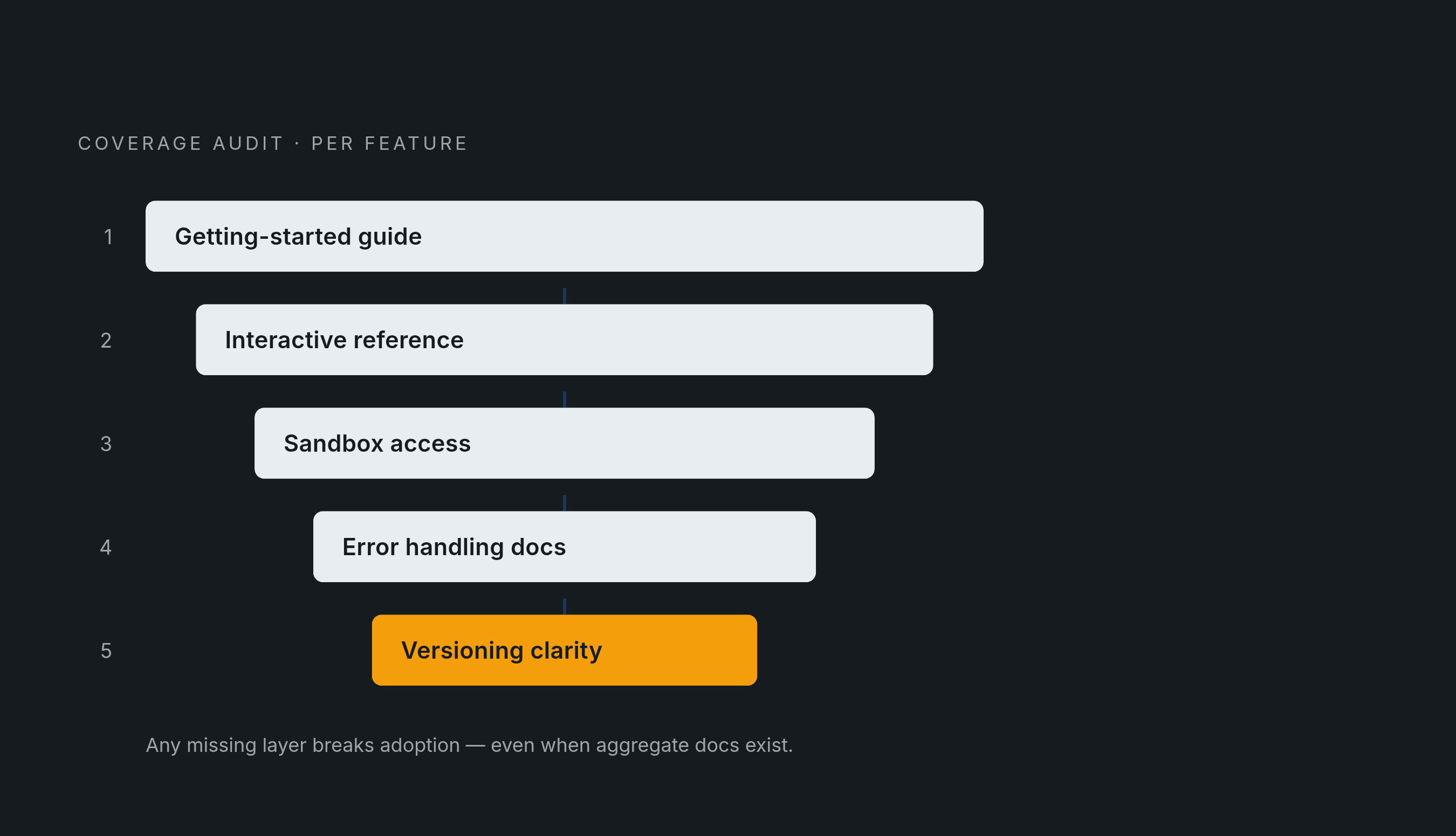
For API documentation specifically, the five layers that most affect adoption are: a getting-started guide, an interactive reference, sandbox access, error handling documentation, and versioning clarity. A coverage audit should verify that each layer exists for each major feature, not just that the product has documentation in aggregate.
Qualitative methods that surface what numbers miss
Watson's practitioner observation has circulated widely for good reason: watching a small number of users interact with documentation for thirty minutes can surface more actionable insight than months of quantitative metrics alone. The mechanism is not mysterious. Behavioral metrics tell you that something failed. User observation tells you where in the cognitive process the failure occurred.
What moderated testing surfaces that metrics cannot includes: where readers get confused even after finding the correct page, which is a clarity problem rather than a findability problem; whether the assumed prerequisite knowledge matches the reader's actual starting point; and whether the reader can complete the task the document was written to support. The last point is the learning-outcome question in real time.
Surveys and satisfaction scores offer a lighter-weight middle ground. They are easier to run at scale than moderated sessions and produce directional data useful for prioritization. Their limitation is that they collect stated preferences rather than observed behavior. A reader who reports satisfaction with a document may still have failed to complete the task it was meant to support. Surveys diagnose what users think happened; task-completion testing diagnoses what actually happened.
The learning-outcome critique, grounded in Merrill's Principles of Instruction, argues that if the purpose of a document is to teach a concept or enable a workflow, the only valid quality measure is whether the reader can perform the task afterward. Satisfaction approximates this. Task completion testing answers it directly.
The consensus across practitioner and academic sources is consistent: qualitative and quantitative signals are complements, not substitutes. A team relying exclusively on one is measuring half the system and cannot know which half.
How AI is changing what can be measured and who does the measuring
The Google DORA 2024 report found that AI adoption correlates with a 7.5% improvement in documentation quality, attributed primarily to automated summarization and consistency enforcement across projects. The same report links a 25% increase in AI adoption to a 2.1% rise in overall developer productivity, a chain that runs partly through documentation quality.
AI documentation tooling has evolved in recognizable waves. The first automated content generation from code comments and specifications. The second, roughly spanning 2024 and 2025, added retrieval grounding so that AI-generated answers cite source articles rather than hallucinating. The current wave, now actively developing, prioritizes code synchronization and multi-agent compatibility, exposing documentation through feeds and endpoints that AI coding assistants can query directly. Documentation is no longer only for human readers; it is infrastructure for agentic systems.
This shift creates new measurement requirements. Standard accuracy metrics used to evaluate AI-generated text do not fully capture the risks, particularly in high-stakes environments where errors propagate downstream before anyone catches them. DeepScribe's composite scoring approach for AI-generated medical documentation illustrates what rigorous measurement looks like in practice. Their June 2024 scorecard combined a Major Defect-Free Rate of 95.9%, a Critical Defect-Free Rate of 100%, a Captured Entity Rate of 90.2%, an Accurate Entity Rate of 96.2%, and a Minimally-Edited Note Rate of 95.0% into a composite score of 95.4%. The framework is notable because it weights errors by severity rather than treating all inaccuracies as equivalent. A missed adjective and a missed diagnosis are not the same failure, and the scoring system reflects that.
Developer documentation teams operating in agentic environments face a version of the same problem. An outdated page does not just confuse a human reader; it propagates incorrect behavior through automated workflows that query documentation to make decisions. The liability compounds with the number of agents querying the system.
In a world where documentation is both a human resource and an AI input, the measurement question expands: not just whether content exists and reads well, but whether it stays synchronized with the product it describes.
Turning measurement into a governance system that actually improves docs
Measurement without ownership is a dashboard problem, not a documentation problem. Roughly half of developer documentation teams use a structured approach to content reuse; nearly a third still rely on copy-paste, according to practitioner surveys of content strategy practices. Both conditions, inconsistent reuse and fragmented ownership, create coverage drift that metrics will surface but that no one is positioned to fix.
A governance structure that actually changes documentation quality requires four elements.
Coverage ownership should map to product surfaces or API areas, and the person responsible for shipping a feature should carry accountability for the documentation coverage score attached to it. This is not punitive; it is structural. The person closest to what the feature does is also closest to what the documentation needs to say.
Review triggers should complement review schedules rather than replace them. A calendar-based review catches drift on a delay. A product change, a support ticket spike, or a search exit rate crossing a defined threshold should automatically flag a page for review, independent of when it was last touched.
Diagnostic review and quality review are different activities requiring different expertise. A diagnostic review asks what the metric indicates. A quality review asks whether the content is correct and complete. Conflating them in a single meeting or assigning both to a single role slows both.
Trend direction matters more than point-in-time scores. A coverage figure that is improving incrementally is a more meaningful signal than a high score that is drifting downward month over month. The direction tells you whether the system is working.
The layered model, when it functions, assigns each measurement type a specific role. Readability scores catch structural problems cheaply and early. Behavioral metrics surface functional failures at scale without requiring active user participation. Coverage audits expose gaps before users encounter them in production. Qualitative testing diagnoses root causes that quantitative signals point toward but cannot explain.
The goal is not a single score. A single score invites optimization, and optimization is not improvement. It is a signal system where each layer informs a different kind of action, and where every metric has a named owner and a documented path from observation to change. That is the difference between measuring documentation and actually improving it.